Guide UX Lab
A code-first, AI-assisted design initiative that produced a working prototype for a new Sonatype SKU, established a migratable design system, and introduced a new workflow for the design team.
tl;dr
This project achieved a triptych of goals: to release a developer-first tool that actually helps developers; to create a new design system that can be adapted by existing SKUs; and spearhead a new, AI-assisted PDLC for rapid go-to-market release. Honestly, it was a dream assignment.
For this project, I designed entirely in VS Code and used AI to accelerate ideation, iteration, and testing. Instead of relying on a mocked prototype for interpretation, I designed and built a working product environment. That artifact, the UX Lab, could be evaluated immediately and intimately by leadership, sales, and engineering teams alike.
The Challenge(s)
Define and design a new product offering for warp-speed GTM release
Sonatype needed a way to create a new SKU without relying on static design artifacts, elongated timelines, and design-to-dev translation errors. The goal was to craft and validate workflows, edge cases, and feasibility early, while also creating a working example to plan and develop from.
Design for developers
- Craft a useful and usable product, specifically suited to solve common jobs-to-be-done (JTBD)
Establish scalable UX
- Ensure new visual and interaction patterns can be easily adopted by existing Sonatype products
Accelerate delivery
- Design directly against production constraints, including performance, to reduce overlap and rework
Provide a usable prototype
- Deliver a working, usable example to support internal discussions and dogfooding exercises
Reduce product risk
- Validate workflows and edge cases in a realistic environment before committing to full engineering implementation
Set a new design standard
- Demonstrate an AI-assisted, code-first approach that reduces handoff friction and improves alignment
My Role
I'm fortunate to have been selected as the lead designer for Guide and the UX Lab project, invited to work closely with Product leadership and executives on a daily basis. My role in each discussion was to act as a champion for the developer-user, tapping into all that I've learned and heard from them over the years.
In the early stages, I collaborated with our small team to define the scope, goals, and success metrics for the initiative. Orbiting the UX around specific workflows, I (and Claude Code) began building out pages, components, and patterns directly in VS Code. As the project progressed, I was responsible for aligning our UX Lab with any recent decisions or pivots, keeping our live artifact up to date. I later worked closely with engineering during the build phase to ensure a smooth handoff, and was ultimately asked to join the development effort myself.
Design-gineer
Built a functional prototype across 15+ feature areas so teams could evaluate real workflows, product behavior, and edge cases during planning and stakeholder review.
Experience Architect
Designed a foundational component library and token system, compatible with and easily adopted by existing Sonatype SKUs, to replace our outdated design system.
Process Guinea Pig
Established a code-first, AI-assisted workflow that improved iteration speed and reduced translation gaps. The project also set a reference model for future design work.
Research & Discovery
Research focused on understanding the problem space before committing to solutions. This included the realities of building security products, the workflows users rely on, and the constraints imposed by existing systems and business goals. The goal was to ground design decisions in real usage, not abstract artifacts.
Product Context & User Workflows
I reviewed how developers, security engineers, and platform teams interact with vulnerability data, trust signals, and remediation guidance. These workflows are often fast-paced, data-dense, and interruption-prone. That context informed decisions around information hierarchy, scanability, and keyboard accessibility from the start.
Competitive Analysis
I reviewed modern security platforms and mature design systems to understand how large datasets remain usable, how accessibility is handled by default, and how consistency is maintained across complex feature sets. This helped identify common interaction patterns that users already expect, as well as gaps where existing tools create friction.
Internal Audit
I audited existing Sonatype products and collaborated with product and engineering teams to identify shared patterns, inconsistencies, and technical constraints. This work surfaced opportunities to create a system that could migrate into current products rather than remain isolated as a prototype.
Technical Research
I evaluated frameworks and libraries early to understand what could realistically be designed and validated in code. Accessibility, performance, and developer experience were treated as design constraints, not implementation details to resolve later.
Design in Service of Developers
This phase of the project consisted of the design decisions that served to shape how developers and security engineers use the Guide interface and MCP server.
Design choices were grounded in real developer workflows and constraints, addressing real pain-points and meeting real needs. Users are often scanning large volumes of security data, prioritizing fixes, and making decisions under time pressure. The interface prioritizes clarity, scanability, and predictable behavior so users can quickly understand what matters and take action with confidence.
Rather than designing features in isolation, I focused on repeatable patterns that support common jobs-to-be-done, while remaining flexible enough for different levels of expertise. This ensured that Guide could function as a cohesive standalone product, while allowing its patterns and components to be adopted naturally across the Sonatype suite.
Core Product Patterns
Developers and security engineers often work under time pressure, scanning large volumes of information to identify the biggest risk and quickest wins. The design prioritizes visual hierarchy and semantic cues to support this behavior.
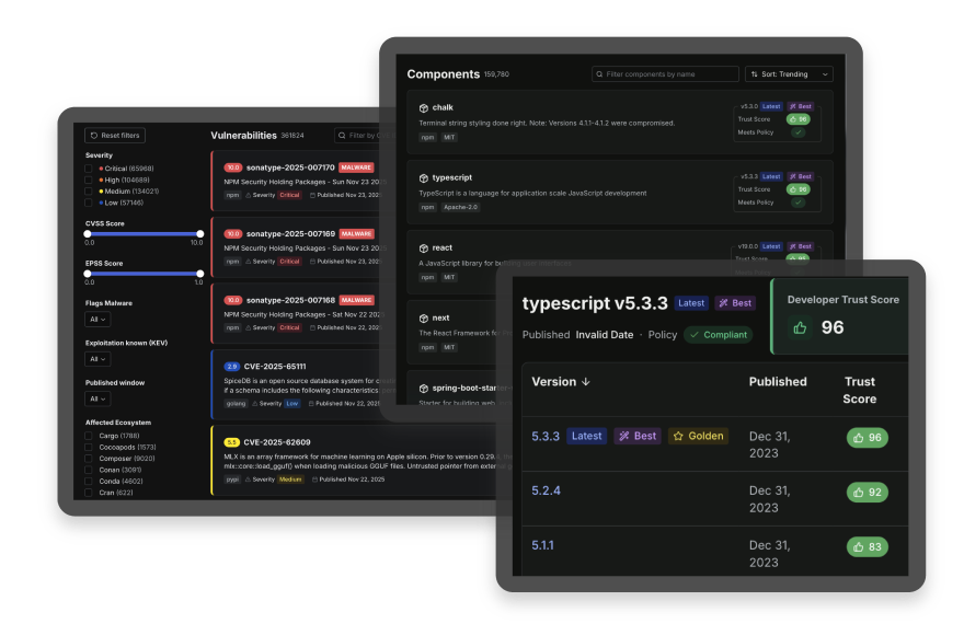
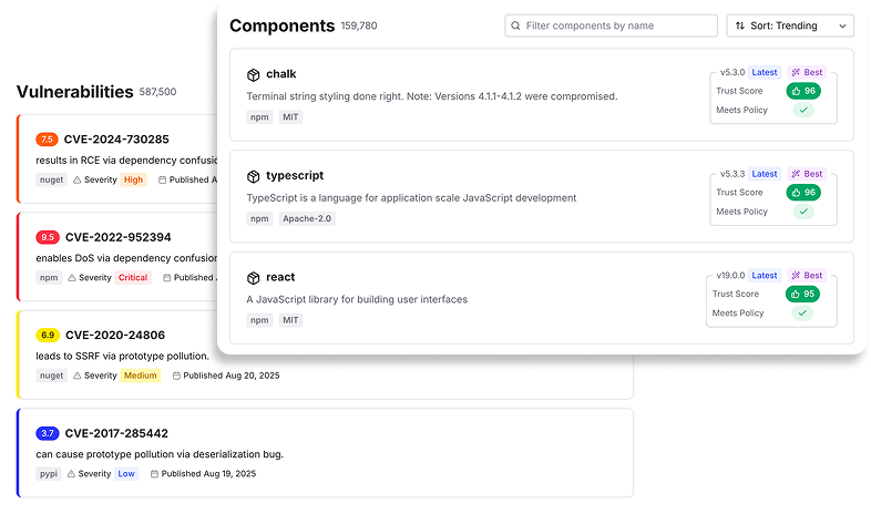
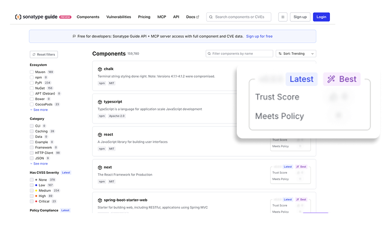
Trust score badges, CVE severity indicators, and CVSS scoring are designed to surface risk at a glance, allowing users to quickly triage issues before diving into detail. Sortable data tables, version comparison views, and multi-faceted search with advanced filtering support exploratory workflows, enabling users to move fluidly between broad overviews and precise queries without losing context.
Dashboards & Analytics
Dashboards were designed to answer a small set of recurring questions: What changed? What requires attention? What actions do I take next?
Run history, time-series reporting, ecosystem breakdowns, and configuration workflows are presented as real application states rather than static summaries. This allows users to trace outcomes back to inputs, understand trends over time, and adjust configurations with confidence.
The design emphasizes scanability and progressive disclosure. High-level signals are surfaced first, with deeper detail available on demand. This supports both quick check-ins and more deliberate analysis, depending on user intent.
Access Control & Monetization
Access control and monetization were treated as product experiences, not overlays. Tier-based access, gated workflows, upgrade prompts, and plan comparison surfaces were designed to feel integrated rather than interruptive.
The goal was to communicate value clearly at the moment it becomes relevant. Users encounter gates in context, tied directly to features or insights they are attempting to access. This approach supports informed decision-making while preserving trust and minimizing frustration, which is especially important in developer-facing tools.
Designing in Production-Ready Code
This was a new experience for me.
The prototype used a production-ready stack so design decisions could be tested against real constraints, including accessibility, performance, responsiveness, and developer experience. Design tokens were treated as a migration layer, allowing visual and interaction patterns to move between products without rewriting components.
Next.js 15 + React 19
Enabled realistic performance characteristics, including streaming and code splitting. This made it possible to validate flows under production-like conditions.
TypeScript Strict Mode
Type safety surfaced edge cases early and improved confidence in component behavior. Interfaces were exported for consistency and reuse.
Radix UI + Tailwind
Accessible primitives provided keyboard navigation and ARIA support by default. Tailwind enabled rapid iteration while keeping styling consistent.
Validating a Real Product Through Working Features
The prototype included 15+ functional feature areas. These were built to validate workflows, business rules, and edge cases in a realistic product environment.
Intelligent Search
Real-time, keyboard-accessible search across multiple entity types with severity-based categorization. Used to validate navigation patterns and ranking assumptions in a data-dense environment.
MCP Analytics
Run history, success rates, ecosystem breakdowns, and configuration workflows are used to validate information hierarchy and CLI behavior.
Vulnerability Analysis
Detailed triage flows with trust scores, CVE severity, remediation guidance, and dependency context. Used to test clarity and decision support for security workflows.
Tier-Based Gating
Freemium gating with upgrade prompts, locked panels, and tier comparison flows. Used to validate packaging decisions and user experience tradeoffs.
Settings & Profile
Account and organization management flows, including authentication, permissions, and team configuration. Built to reflect real enterprise SaaS expectations.
Billing & Plans
Plan comparison, upgrades, usage tracking, and checkout flow logic. Used to validate customer lifecycle scenarios.
Impact & Results
Product & Organizational Impact
- Shared product language Established a consistent visual and interaction system intended for adoption beyond the prototype.
- Faster delivery Designing directly in production code reduced rework and shortened the path from concept to implementation.
- Stakeholder confidence A working prototype helped leadership, sales, and engineering evaluate product behavior early.
- Reduced product risk Workflows and edge cases were validated before committing to full-scale engineering.
- Process influence The Lab demonstrated a viable AI-assisted, code-first workflow that reduced handoff friction.
Quantifiable Outcomes
Design Decisions Validated in Production
- Accessibility WCAG 2.1 AA behavior was validated during design, including keyboard navigation and ARIA labeling.
- Performance Streaming, lazy loading, and code splitting were exercised under production-like conditions.
- Responsiveness Mobile-first layouts and responsive behavior were validated across features and states.
- Reliability Strict TypeScript surfaced edge cases early and improved confidence in component behavior.
Reflections & What This Changed
What Worked Well
- Design as a living artifact Because the prototype was the product environment, there was less drift between intent and implementation.
- Accessibility-first foundations Starting with accessible primitives kept inclusive behavior as a default, not a retrofit.
- Type safety as a design tool Strict typing revealed edge cases early and improved component reliability.
- Real data improved realism Using actual CVEs and dependency data surfaced usability problems that mock content would have hidden.
- Progressive composition Building components in isolation before composition reduced complexity and prevented cascading issues.
Design & Engineering Standards Established
- Default to accessible primitives and keyboard-first interactions.
- Standardize iconography to support consistency and performance.
- Use mobile-first layout patterns across components and flows.
- Export TypeScript interfaces for component APIs to support reuse and safety.
- Handle empty, null, and error states explicitly to reduce hidden failures.
- Use semantic design tokens to support theming and future adoption.
What I'd Do Next
Extract the component library into a shared package, add interactive documentation (Storybook or similar), implement visual regression testing, and align design tokens between code and Figma. The goal would be faster adoption across products with lower maintenance cost.